


HSC Showcase: Visual Art 2021
Class of 2021 HSC Major Work in Visual Art


Radhika Babla
PATTERNS OF TIME
My body of work depicts the westernisation of Indian culture. The materials used were acrylic paint and henna. The purpose of the work is to highlight the significant changes westernisation has created upon India. The purpose was represented through the incorporation of patterns, clothing and interior. Using henna was a deliberate choice because of the rich history towards Indian culture and the importance of pattern and symbols used within henna. The drastic change of henna patterns highlights the impact westernisation has on Indian culture. By surrounding the painting depicting a ‘traditional India’ with traditional Henna patterns and surrounding the ‘westernised India’ painting with western henna patterns, it further shows the change. The symbolism of gender roles is also depicted, as in the top painting, the female sitting and male standing represents traditional gender roles, and the male and female being separated and both standing in the bottom painting, shows equality and change that has been brought over time. The clothing also heavily depicts the impacts of westernisation as more traditional and detailed clothing is worn in the top painting whereas the bottom painting depicts a more modern and westernised style further highlighting the loss of culture being demonstrated.


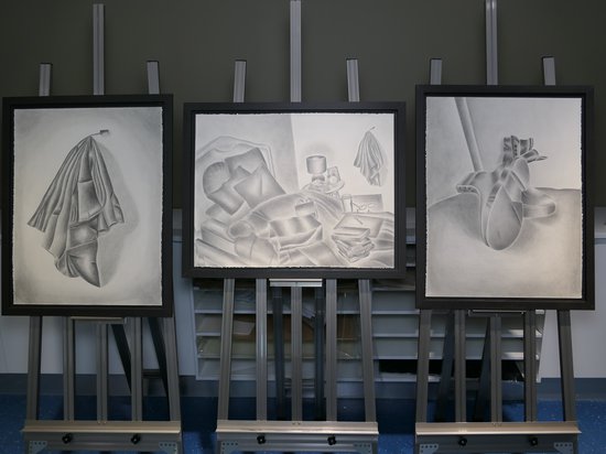


Madeline Bulliard
THE NIGHT IS MORE RICHLY COLOURED THAN THE DAY
The synthesis of works titled The Night Is More Richly Coloured Than The Day plays with the isolating yet collective experience of insomnia. Its purpose is to showcase an honest and desolate representation of an inherently isolating experience, while concurrently one that most people have experienced and keep to themselves.
Lead pencil was used as the sole material for the works to be monochromatic, symbolising the melancholic nature of insomnia. With the lead pencil, a soft rendering technique was also applied, which captured the state of haziness a person may experience with sleep deprivation. The papers used were of a large scale to provide visual impact in confronting the audience. Therefore, taking away the isolation of the experience. The artworks illuminated the idea of having a personal yet outwardly perspective, through the use of angles. Each work has an intentional distance between the audience and the body of works. The frames presenting the works also add to the idea of being on ‘the outside looking in’ by adding distance between the works and audience. The theme of stillness was used throughout the works, through the incorporation of subdued, simple everyday objects. This is ironic as it juxtaposes the anxiety and stress many people feel when experiencing insomnia.
In terms of symbolism, inconsistent lighting was used to provide an element of messiness to the work, meaning to provide an unpleasant feeling to the audience, a feeling experienced by a person with insomnia. The continued use of drapery implies how insomnia is universally experienced as it is an everyday object used by many people. It is also a classical allusion. Influences heavily include the connotations surrounding the post-impressionist artist Vincent Van Gogh and the raw, thought-provoking contemporary piece ‘My Bed’ by Tracey Emin. Van Gogh is globally recognised and notoriously considered as a comforting artist; an artist people go to when dealing with hardships such as insomnia. His artwork ‘Bedroom in Arles’ inspired the works to be personal as well as drawing one’s own bedroom from an outwardly perspective. The symbol of boots is inspired by his work ‘A Pair of Shoes’, which symbolise Van Gogh’s weary and threadbare life. They intentionally connotate the feeling of desolation. Emin’s installation ‘My Bed’ inspired the concept of an unmade bed. Her personal and uncomfortable work provokes a great emotional turmoil as it subverts the typically peaceful notion of a bed. The body of work is deliberately personal and wearisome to look at.


Matilda Davidson
THE AUSTRALIAN DREAM
“The Australian Dream” aims to accurately capture the isolation and loneliness experienced by my immigrant grandparents. All of the art pieces are reflective of the journey undertaken by my grandparents and demonstrates the contrast between their life in Malta and their life in Australia. The three postcard pieces are painted using gouache in monochromatic greyscale, which is indicative of the powerful feelings of loneliness, and how a once busy family home has become desolate and barren. The small pops of light blue in the pictures and windows are a homage to their life back in Malta, creating a motif of how vastly different their life was back in Malta. The theme of blue is continued through the postcards, each containing a depiction of a national plant and animal, which are symbolic of their overwhelmingly strong connection to their homeland. The final component of the artwork are the letters, both written from the perspective of my Nanny, and they detail the contrasting experiences of joy and excitement in comparison to loneliness and melancholy.


Mairead Fish
NOVY DOMOV, A NEW HOME
My installation Novy Domov, A New Home portrays the journey of my grandfather’s life, from his home country, the Czech Republic, during World War II whilst imprisoned in a labour camp, to Australia where he achieved freedom. He travelled on a ship called the ‘Fairsea’, unbeknownst to the location of its landing, he then arrived and got his immigration papers after a few years of working in a refugee camp to earn his way. This installation spotlights the potentially unknown struggles and lifelong trauma people can face. Tired, busy, worn out from life and having six children, he still managed to survive. The ascending lights highlight over each graphite drawing and illuminating the surrounding wire sculpture and imitation immigration form. Photorealistic graphite artist Cath Riley, symbolist painter Zhang Xiaogang, and wire sculptor Barbara Licha all influenced my work. Of course, my grandfather's strength, resilience, and determination inspired me and is shown throughout my installation.


Alvina Hasty
IN SIGHT, DIALOGUE, SUSPENSE, AWAKENING
"Everything we see hides another thing, we always want to see what is hidden by what we see." - Rene Magritte.
In Western culture, the serpent is something sinister, corrupting. In Eastern culture, however, the naga, a snake-like being, was the benevolent protector of the Buddha. In my work, the naga is symbolic of the self beneath ourselves. Whether the woman in my work faces one that is sinister or benevolent is of no matter. Meaning is both created and distorted by ourselves. Chaos driven by both disconnection and fixation. What matters is that she is indeed conversing with it. Every person carries a world within the room of their soul, tumultuous and yet as constant as the sea, fragmented and yet unified. When all parts of ourselves are made whole, there is harmony, however true stability will never be achieved because time dictates change. Bondage and acceptance are two faces of the same coin. Drawing on Buddhist symbolism such as the naga and lotus flower, as well as surrealist and impressionistic elements, I seek to represent one version of the microcosm that inhabits us all; one that we all bear witness to but do not visit enough ourselves.


Claire Kim
WHY TIME RUNS LATE
My work focuses on the fear associated with taking opportunities, leading to pessimistic views about the future, in a Surrealist drawing. The triptych formation and continuous motifs create a story to underline the safety of ‘normalcy’ and the potential risks of breaking out of this routine. Organic shapes, likewise the water, and living creatures throughout, indicate change and the continuation of life. Hence, accenting the extent of control an individual has over their lives and futures, as observed by the objects within the interior of the work. Influences include Salvador Dali and Sandy Skoglund, who explored a dream-like quality to their artworks, to synthesise the normalcy of the everyday world with personal emotions, experiences or opinions.


Tahlia Lee
GENERATIONS
My artistic practice ironically utilises digital illustration to comment on the mundane reality and influence of technology on contemporary society within my series ‘generations’ comprised of five works. The utilisation of digital media to convey the harsh realities of cellular technology comments on our addiction which, when coupled with the subjects blending into their surroundings, critiques technology’s influence on our own identity in which we metaphorically conform to our surroundings. The works ‘evening chatter’ (two adults on couch) and ‘ghosted’ (young girl crying) convey the influence of technology on our relationships with others. Whilst the works ‘Day #467’ (repeated figure on stairs) and ‘socialising’ (girls at bus stop) communicate technology’s repetitious influence within our daily lives. The final work, ‘Out with the old in with the new’ (old man), conveys the progression of technology and the older generations difficulty to keep up. Influences include Bill Henson’s dramatic imagery a significant influence for the chiaroscuro lighting choice, Robert Götzfried’s ‘the lockdown diaries’ for subject matter and Alexis Franklin and Vladislav Trotsenko digital drawings for artistic style.
Grace Murray
ART ACTIVISM 101
The objective of my body of work was to draw attention to the inequities within the Australian education system. I wanted to highlight the inequities surrounding students of different gender and age, and teachers. Specifically, I focused on the Gonski 2.0 report, which outlined the “needs based learning” plans for the Australian education system. Throughout my research, I discovered that the overgeneralised plans for this report left some public schools worse off regarding their funding. I wanted to highlight the inequities surrounding this report through my body of work. I was heavily inspired by the Guerrilla Girls and their art practices. Specifically, I was interested by the art activism ideologies that the Guerrilla Girls utilise to address the political and social issues of sexism and racism in the art world. I appropriated famous artworks from the Guerrilla Girls, including “Dearest Art Collector”, 1986, “Horror on the National Mall”, 2007, “Do women have to be naked to get into the Met. Museum?”, 1989 and “We sell white bread”, 1987. All of these artworks inspired me to create my body of work. Specifically, the use of satire in the Guerrilla Girls artworks inspired me to create my own witty and satirical voice that I carried out across the entirety of my artwork. Additionally, the colour palette of my artwork was a nod to the Guerrilla girls with the use of the iconic bright yellow and magenta. I used Photoshop and Illustrator to create my body of work. I edited the photographs using black and white filters to create unity in my body of work and continue the appropriation from the Guerrilla Girls, who photographed mainly in black and white.


Pankti Patel
LIVING ROOM
The concept of westernisation of Indian interior design is explored in my triptych artwork named "Living Room." The use of vibrant colours throughout the artwork is symbolic of Indian culture. Lord Krishna is connected with the most commonly used colour, blue (a highly worshipped God). The Indian cultures' symbolic meaning is represented through the colour palette. Because of the inclusion of the light and dark method pioneered by well-known artist Leonardo da Vinci, acrylic paint on canvas was a conscious decision. Influences include contemporary artist Frida Kahlo, Dutch painter Marcel Hess, Frans van Mieris and ultimately Vincent van Gogh's use of colour to successfully communicate his message to the audience was reflected in my artwork.
Madeline Siu
ANY GIVEN SUNDAY
Appropriating the phrase, "any given Sunday”, the works depict fleeting moments in time, where the lives of the observer and the people within each image briefly intersect purely by chance and could have occurred on any given (Sun)day. The subject matter is based on photographs I captured in locations such as New York, Tokyo and Paris. Illustrating random moments in the life of ordinary people from an observer’s perspective, provokes questions such as, ‘Who are they?’, or ‘What life do they lead?’. This stimulates a sense of wonder and a realisation that each person has a life just as vivid as another, nuanced with simple yet precious moments like playing cards in a park or a coffee in a cafe. Acrylic paint was effective in capturing these moments in detail, yet still preserves the freeness of the brushstrokes to convey the transience of life. Inspiration includes Edward Hopper and Jeffrey Smart, who both create thought-provoking urban landscapes.


Eloise Wilkes
FROM THE ROOTS
From The Roots is a triptych work made using a regular blackballed point pen on large white paper, capturing the concept of hair in identity. Black ballpoint pen was chosen as it was an expressive medium that shows the detail in the form and placement of the hair, as well as blending it into the rest of the portrait forming one whole shape. The texture and lines of the piece give light to the individualised portraits, using hatching and shading techniques. The portraits range from having neat hatching, displaying content state, to chaotic scratch like hatching to portray an intense discomfort in one's identity. Each work explores an individual and how they see themselves with a focus on their hair. I choose hair due to how we subconsciously tell stories about ourselves through our hair without even realising it. After interviewing three subjects, different ideas stood out for me in each person, ideas like culture, sexuality, and change. Noticing how hair represented and connected to each person and the way they see themselves, I positioned both their body language and hair into what they communicated through their words, keywords like “overwhelming”, “confident” and “disconnected”.